project reveal: mid-century inspired music room

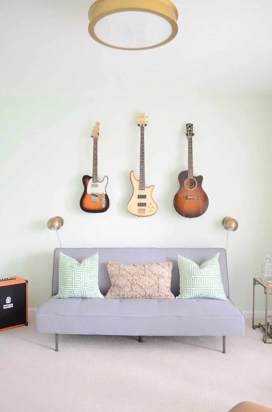
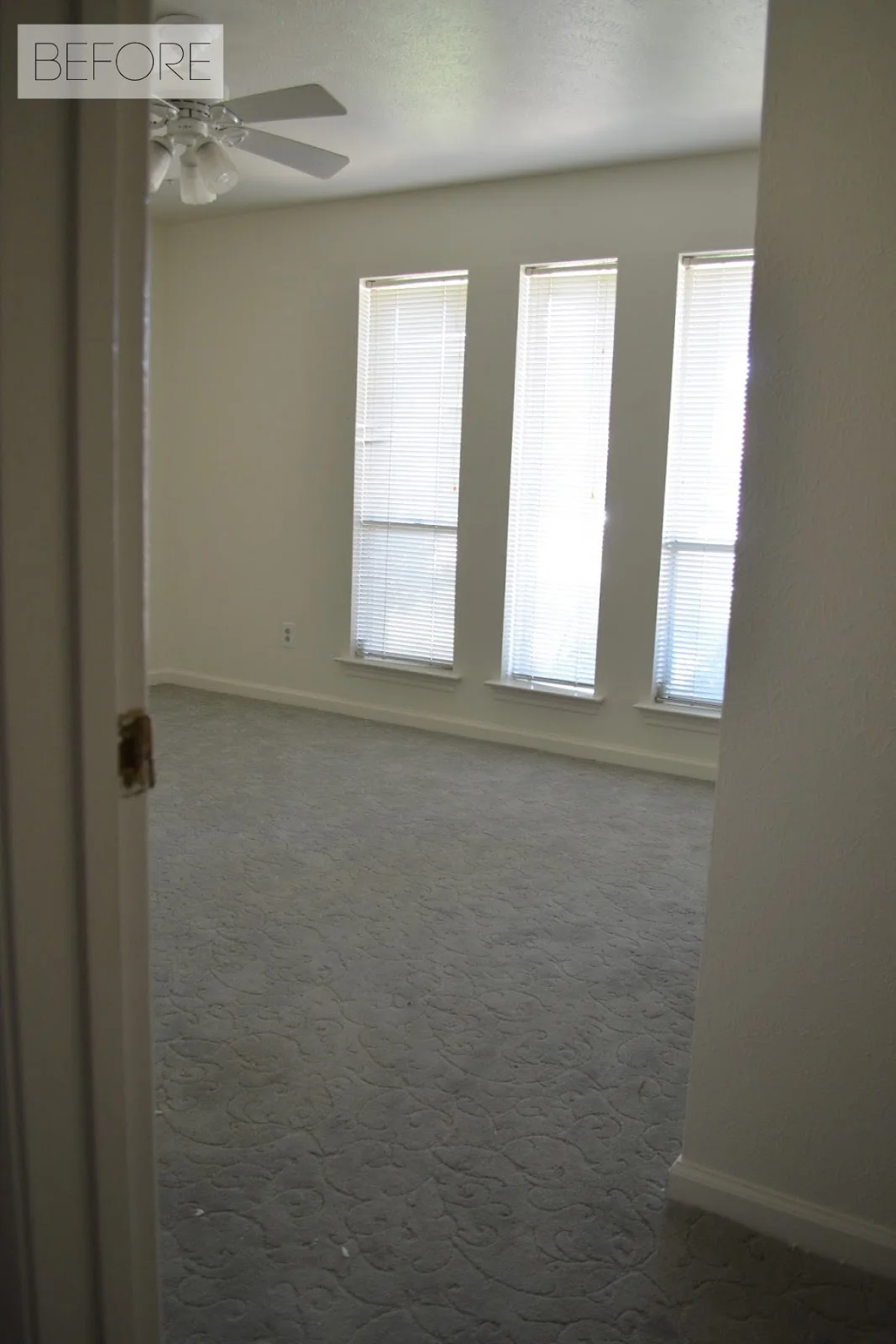
You may remember back in May when I shared a small update on this room after we put in new flooring. We didn't touch it for almost a year and we never, ever went in here because it had no function. I had always planned for this extra bedroom in our house to be used for Charlie's music/"man" room (you can see the beginning of my plans for this room in this post and this post). I also wanted it to function as a secondary guest room because we occasionally have extra visitors and I feel awful when they have to sleep on an inflatable mattress.

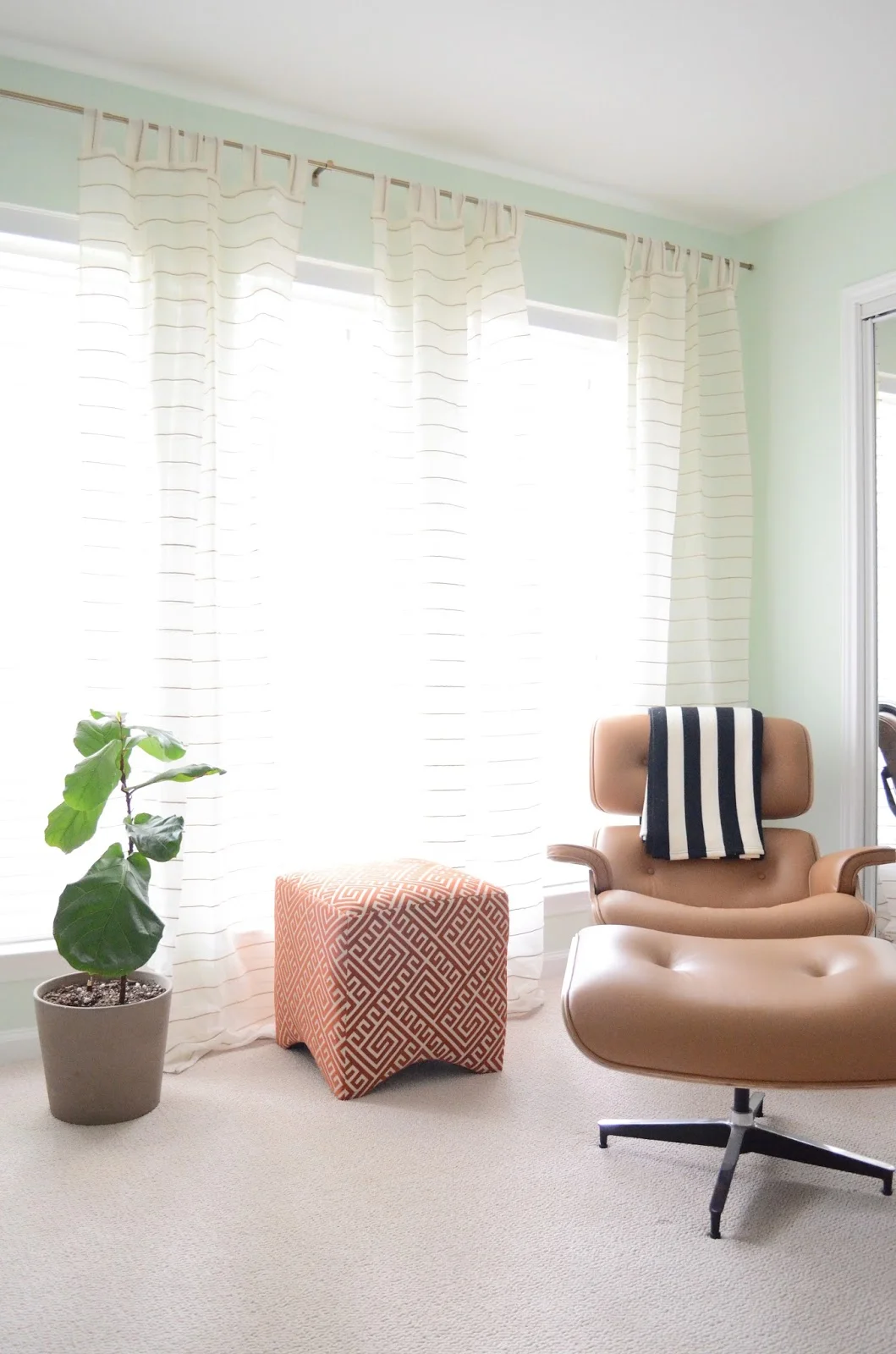
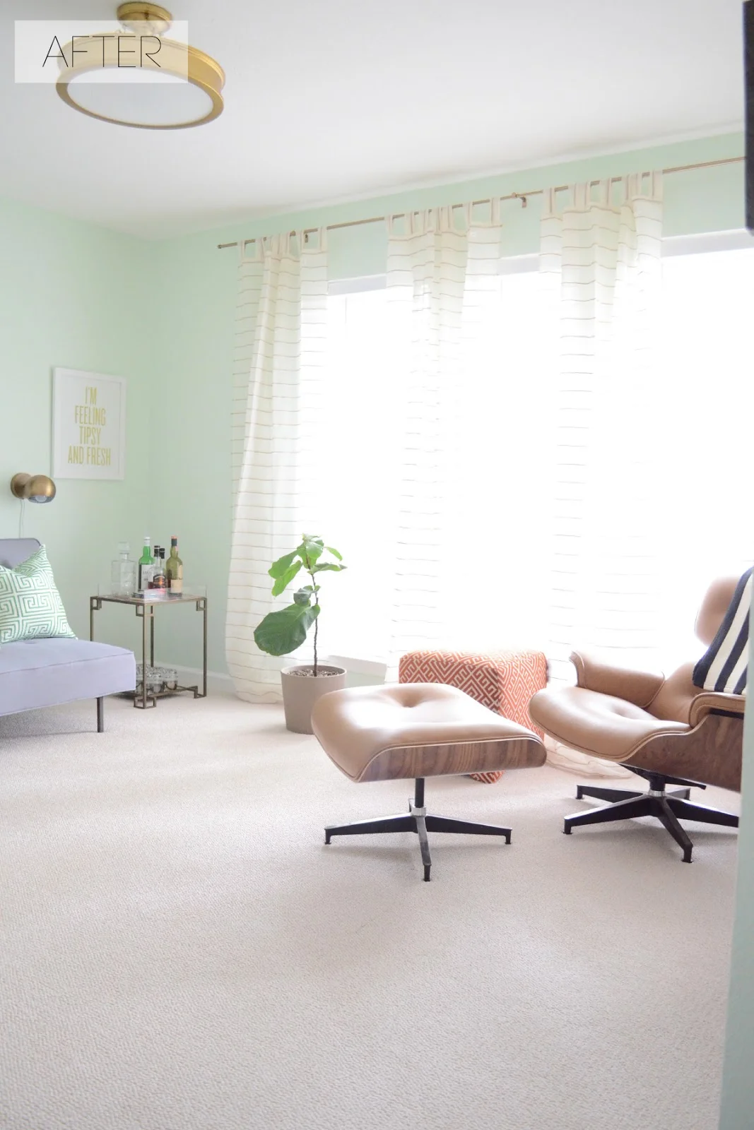
I was convinced I wanted to paint this room a dark shade of green, but I could never get Charlie on board. I let him pick out the paint color, and it totally surprised me that he picked this airy shade of mint green. It is called  Breath of Spring by Behr. At first I really wasn't sure about it because I thought it made the room look like a nursery, but after putting everything in the room it's definitely growing on me. We also replaced the outdated ceiling fan with this gold semi-flush light by Minka Lavery.

You may have seen my instagram post about this little ottoman that I found last week on a HomeGoods run. I envisioned using it as a movable ottoman/small coffee table for the sofa bed, but the proportions were all wrong. I'm saving it for when we upgrade to a sleeper sofa, and for now I'm using it as a temporary side table for our Eames look-alike chair, which was one of the first (and one of my favorite) purchases we made for this house! 

This sofa bed is very temporary, and is only here to keep our extra guests from having to sleep on the floor. Unfortunately the color is much more blue than it appeared online, so it sort of clashes with everything. Since we're only keeping it for a short time I refuse to buy things to make it work, so right now I'm using things that don't necessarily "go" with it, but I plan to keep long term. I'm kind of mad at myself for buying it in the first place, but for now I'll just have to deal with it making everything look a little off.

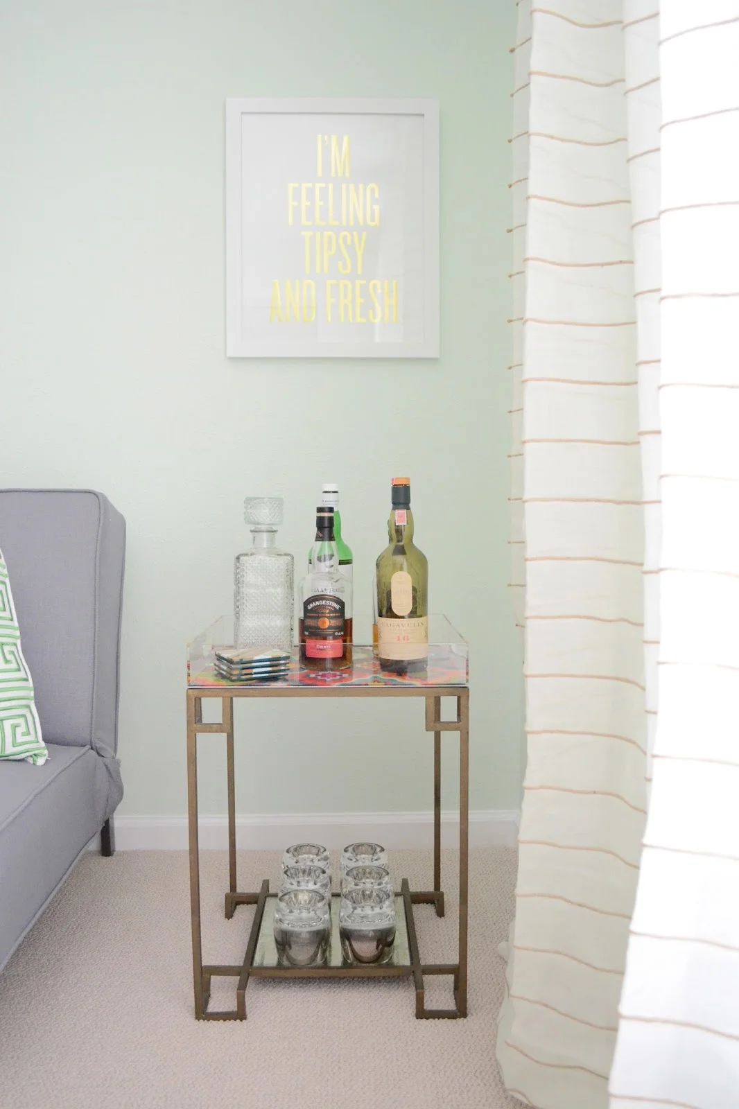
I created a small whiskey and scotch bar in this corner, complete with one of my favorite prints from the local Dallas business, Read Between the Lines.

The part of the room that you don't see in these pictures are the 80's mirrored closet doors and an unpainted interior door. I've ordered the new closet doors, and once they're painted and installed I'll share with you what a difference it makes!
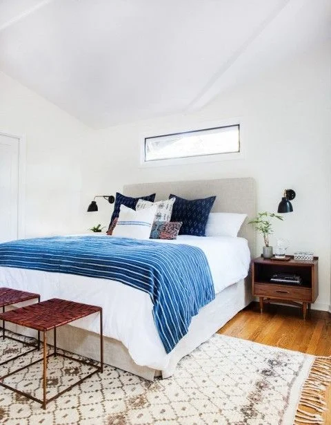
color crush: indigo and white

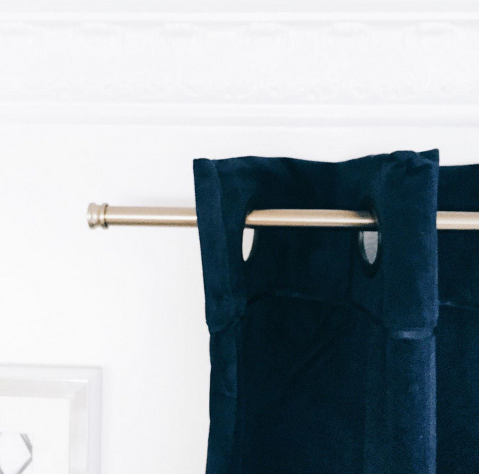
It's taking over all of my designs recently, and I just can't get enough of indigo paired with a crisp white. You may have seen that I posted this little sneak peek of our bedroom on instagram and twitter:

The combination of white, indigo, and brass just has me all excited. We're still waiting on things to come in, but my goal is to have our bedroom ready to share in March.

<<via>>

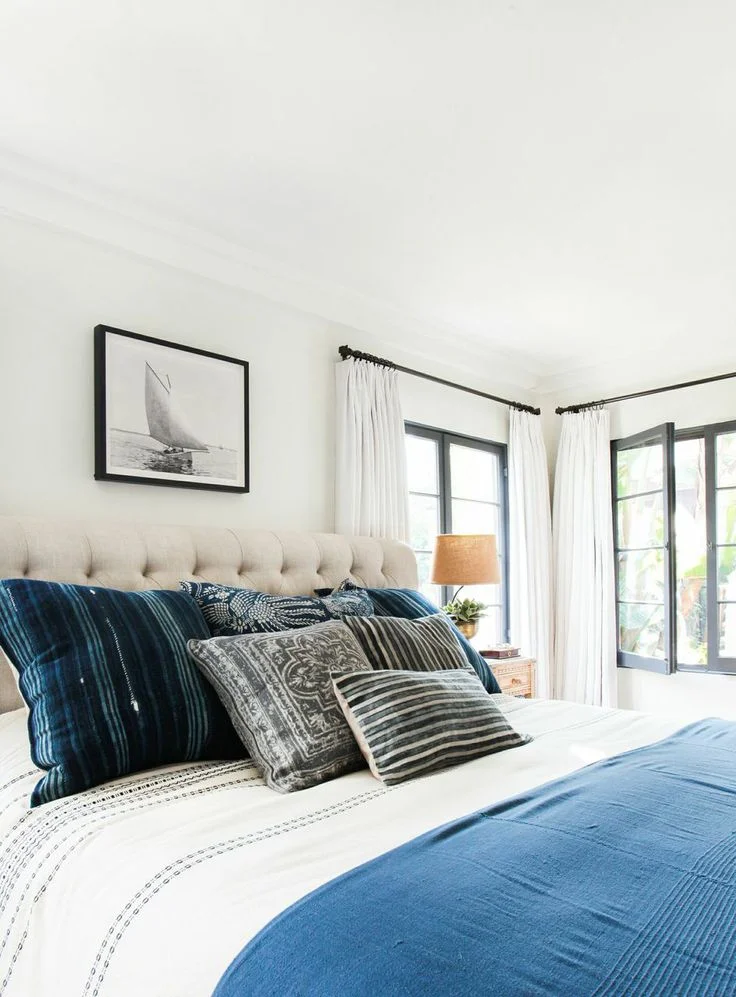
This bedroom from Amber Interiors is perfection, as are all of her designs!

<< via Amber Interiors>>

And everything that Emily Henderson designs is on point.

<< via Emily Henderson>>

What is your favorite color combination as of late?

project: bedroom makeover

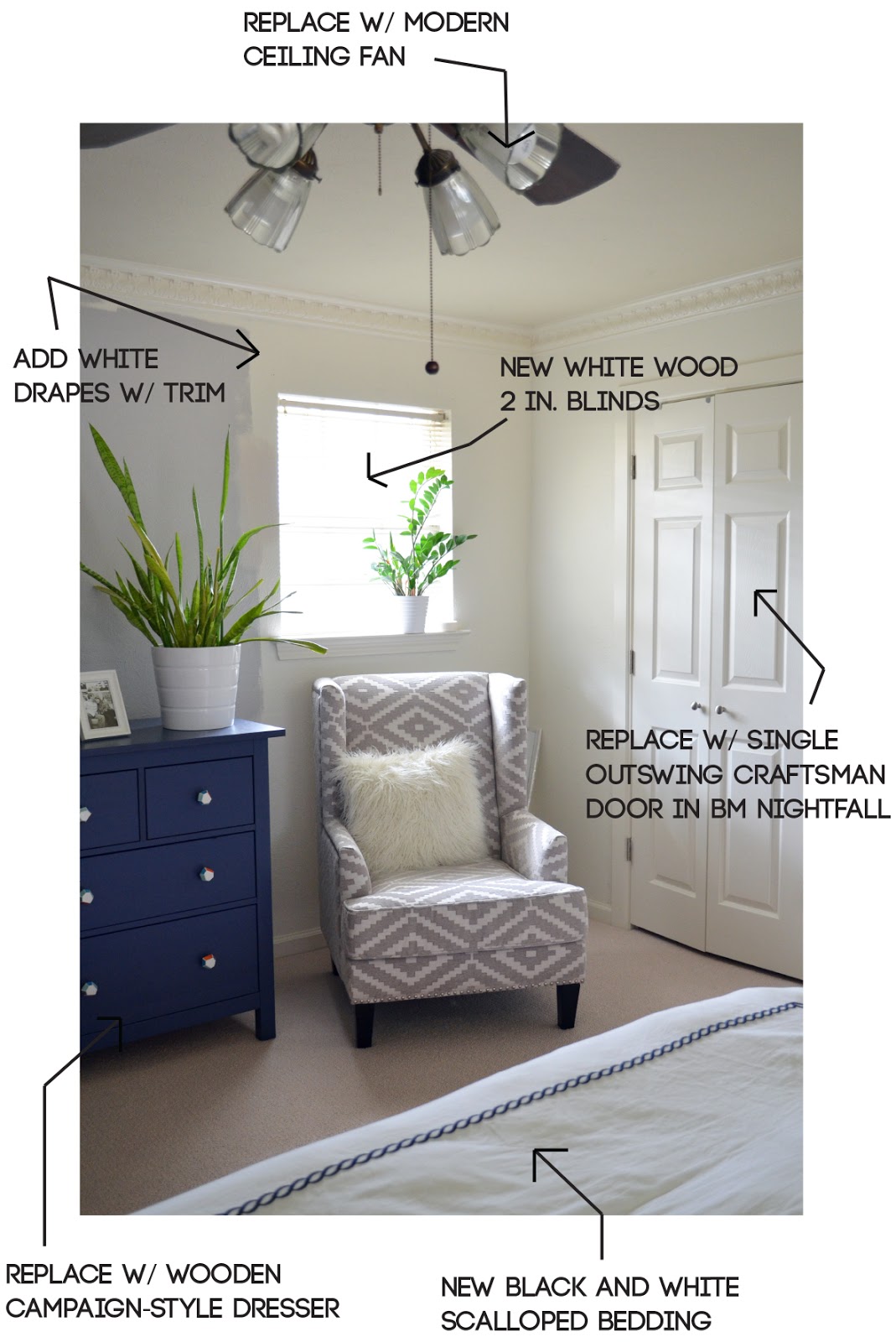
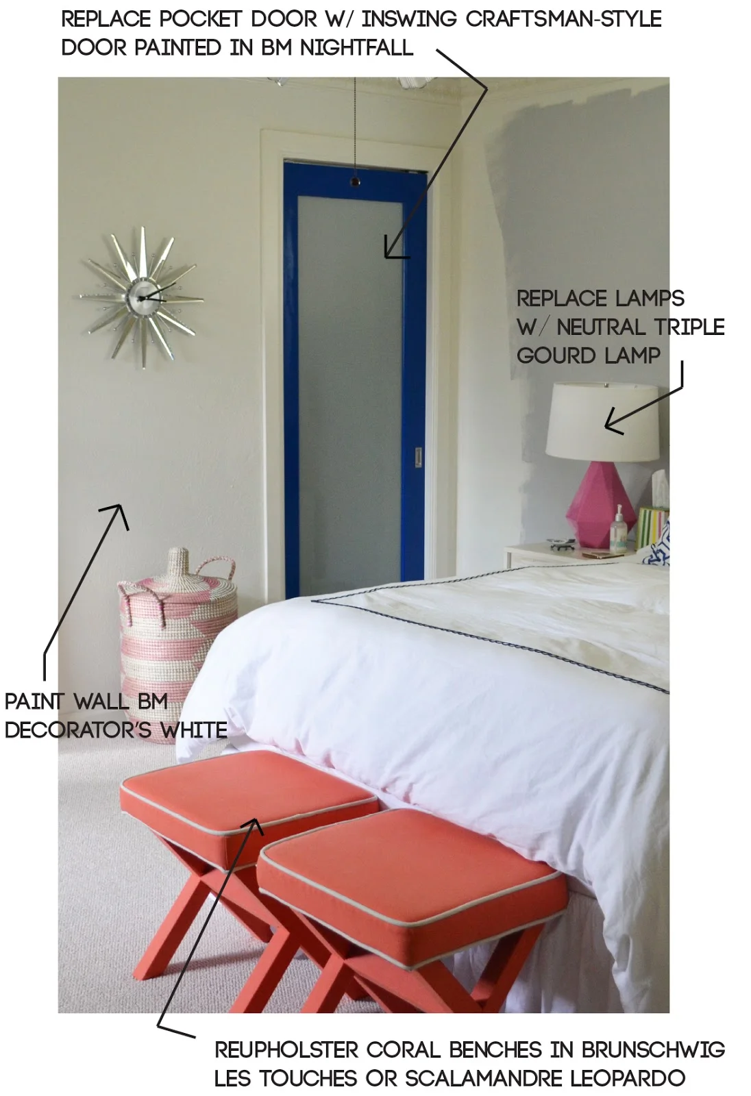
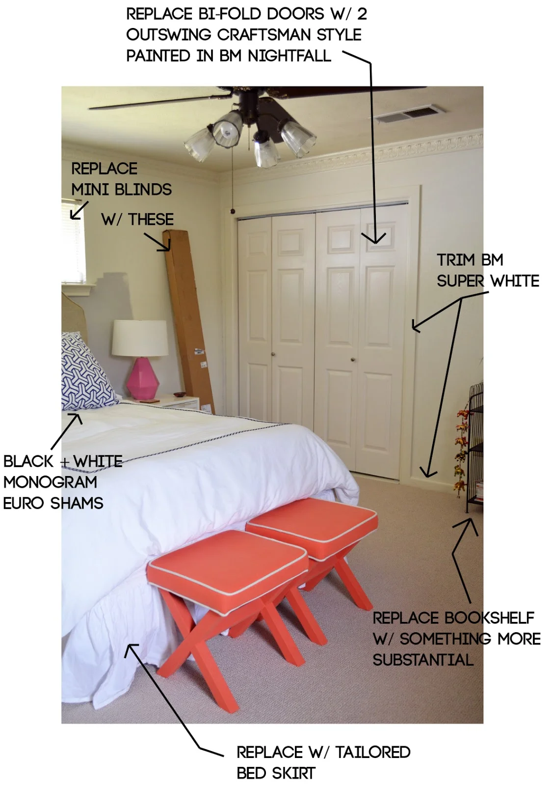
I updated on changing our bedroom carpet back in May, and exactly zero has changed since then (with the exception of purchasing this chair). I tend to abandon designing our master bedroom until the very end because it's the least visited room when we have guests, but I'm tired of living in a mismatched mess, so it's been moved up on my priority list. Here are my current plans for the space:

Here you can see my serious paint indecision. I originally planned to paint it BM Stonington Gray like our living room, but once I got it up on a couple of walls I realized it was going to show way too purple. Then, I went a bit lighter with BM Wickham and it felt too blue, so I totally changed directions and tried BM Athena. After I realized this was too beige I was bummed out, and went back to my inspiration images to realize I needed to paint it white. I've been wanting to paint our bedroom white for years, so BM Decorator's White it is! The ceiling and trim will be BM Super White.

This bright blue pocket door hurts my eyes every time I look at it. Not only is it so very wrong for the space, it was installed wrong so there is a 1-inch gap at the top. The glass also makes light flood the room when you get up in the middle of the night guaranteeing that you'll wake up whoever is sleeping, so it's an all around bad design decision... and precisely why most people should to consult with a designer before making changes to their homes!

No, our walls aren't dirty, that's just the awful shade of glossy "white" they decided to paint everything. It's just so... blah and just changing this will totally change the feel of the room. We're also changing out these bi-fold closet doors to double doors similar to this.

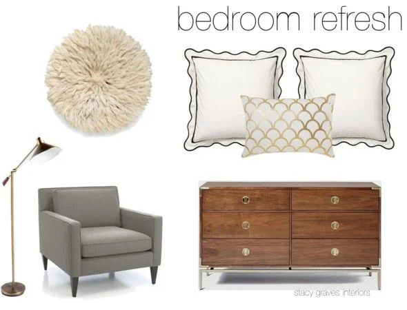
Here is a bit of my design inspiration:

While there is a lot to do, it's mostly quick fixes so I'm hoping it won't take me too long (famous last words). I'll keep you posted on my progress via instagram and share a full reveal on here as soon as it's finished!